2026’s summer has definitely been a warm one!
It’s easy to forget now that we have started Autumn in earnest, but the Sun sure made its presence hard to ignore during those heatwaves we had on July and August. So I thought this would be as good a time as any to talk about one of the features I’ve been working on recently for Plan.City: our new Solar Energy tool.
The idea behind it is relatively straightforward: if we have a detailed 3D model of a city, can we use it to get a better understanding of how much solar energy reaches the buildings within it?
Well… that’s what we’re trying to find out!
Looking at our rooftops
There are plenty of reasons why this information can be useful, but perhaps the most obvious is solar panels. If we’re considering installing them on a building, knowing which parts of its roof receive the most solar energy, and how that changes throughout the year, can help us start to understand where they could be most effective.
But there’s another side to the problem that I find particularly interesting: cities don’t stand still!
Imagine that a new development is proposed next to an existing building. If that development is considerably taller than its surroundings, how will the additional shadow it creates affect nearby rooftops? Could we compare the situation before and after the new building is constructed?
Those are some of the questions we’d eventually like Plan.City to help answer.
But first, we need to start with the basics!
So, how does it work?
For the first version of the tool, the process begins by selecting a building that we want to analyse.
Plan.City then inspects its roof and divides the area we’re interested in into a collection of smaller sampling areas. Each of these can be analysed independently, giving us considerably more information than a single value for the building as a whole.
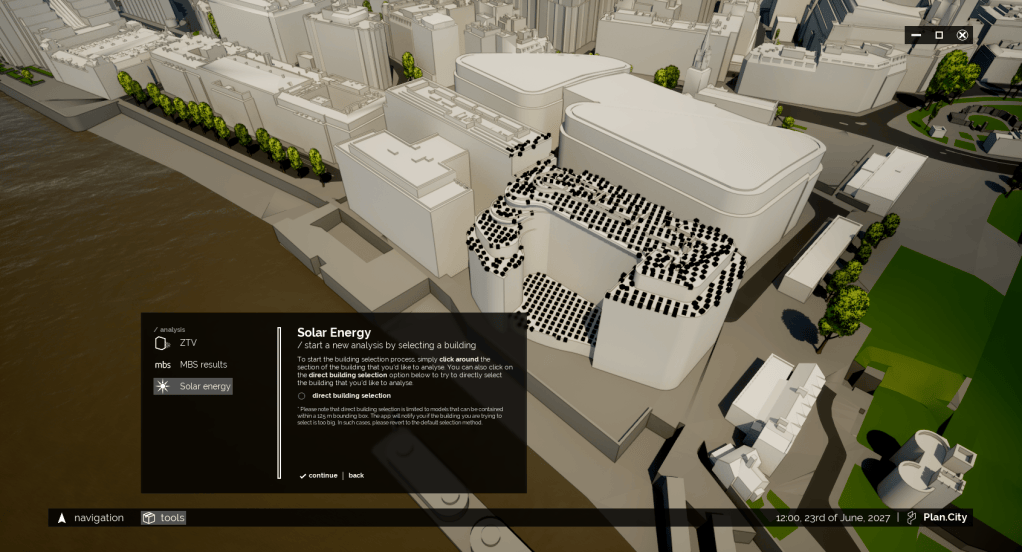
From there, we can look at the selected period of time and estimate the solar energy reaching the different parts of the roof.
Of course, knowing where the Sun is isn’t quite enough.
A roof isn’t necessarily flat, for starters. Different surfaces can face different directions and have different slopes, meaning that two parts of the same building may receive very different amounts of solar energy. And then there are all the other buildings to consider!
A point on a roof might theoretically face the Sun, but if there’s a tower standing between the two, that direct sunlight isn’t going to get very far. Having the surrounding city available as actual 3D geometry means we can take those obstructions into account as part of the analysis.
The result is something that we can display directly on top of the building itself, turning a rather large collection of numbers into something much easier to understand at a glance.
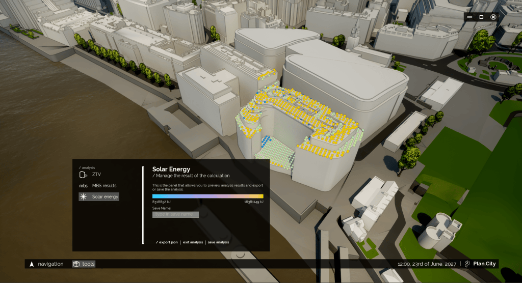
Suddenly, those differences across the roof become much easier to spot!
Where do we go from here?
As with many of the tools we’ve been developing for Plan.City, this first version is really about putting the foundations in place.
Being able to analyse solar exposure is useful on its own, but it also gives us the starting point for several other tools we’d like to explore.
For example, once we understand the amount of solar energy reaching a roof, we can begin looking at what that might mean for photovoltaic panels placed there. Likewise, being able to run the analysis under different urban scenarios could allow us to compare how a proposed development changes the solar exposure of the buildings around it.
There’s still work to do before we get there, of course!
For now, we’re working on getting this first iteration of the Solar Energy tool ready for an upcoming Plan.City update. I’ll probably come back to it in a future post once things have progressed a little further.
In the meantime, I’ll leave you with a quick video of the tool in action below.
Hope you find it interesting and useful!
See you on the next post 🙂

